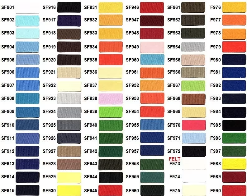
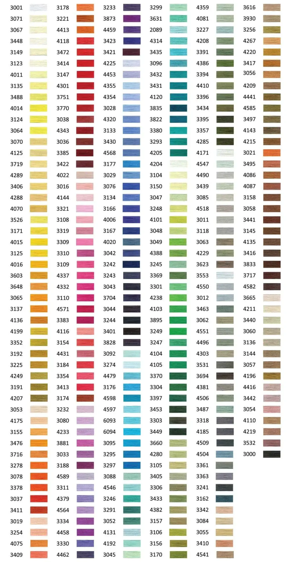
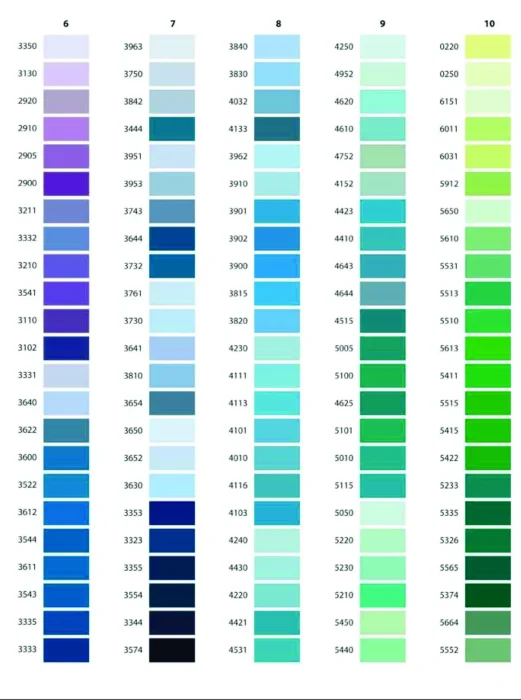
If you’ve ever spent 20 minutes staring at an embroidery thread color chart trying to decide between two shades of blue, you’re definitely not alone.
One of the most common questions we hear from customers ordering custom patches, embroidered hats, and logo embroidery is:
“Why does my design look different when stitched compared to the screen?”
The answer usually comes down to thread colors.
Unlike digital printing, embroidery uses real threads that interact with fabric texture, lighting, stitch direction, and garment color. That’s why choosing the right embroidery thread colors can make or break a design.

Across the United States, these thread colors consistently remain customer favorites:
These colors are especially common for:
Natural sunlight reflects differently from polyester embroidery threads, making colors appear lighter or brighter than indoor lighting.
Start by considering your fabric color, logo details, and where the embroidered item will be used. High-contrast thread colors usually produce the sharpest results, especially on hats, jackets, and uniforms. If your brand has specific colors, use an embroidery thread color chart to find the closest match. For the most accurate outcome, request a digital proof or stitch sample before full production.
There isn’t one universal best color. The right choice depends on fabric color, logo design, and intended visibility.
Many embroidery thread manufacturers offer close Pantone matches, but exact matches aren’t always possible due to thread material and texture.